Hi all,
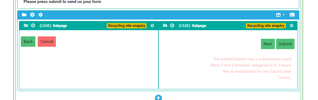
Trying to get the buttons which sit at the bottom of our forms to be able to sit inline with each other when the browser switches to a mobile view. The attached screenshots show what happens.
I’ve tried introducing bootstrap classes and some custom CSS to try and get it inline but nothing seems to work.
Here’s how they look on the layout.
Any assistance would be much appreciated!
Craig
Hi Craig
When you have two panels next to each other on desktop it works fine… but the default behaviour on mobile is for the containers to collapse underneath each other.
Without seeing your exact build, you could try this:
- Click on the cog on the blue container of your two blocks.
- Open the ‘Advanced’ tab in the right hand side of pagebuilder and in the Custom CSS Class, add a class like button2col
- In your CSS stylesheet, add the following code:
@media (max-width: 576px) {
    .page_container.row.button2col {
        display: grid;
        grid-template-columns: 1fr 1fr;
    }
}
Hope this helps in some way 
Paul
2 Likes