Because MATS is built to give the builder the simplest way to create pages, sometimes a little work can greatly improve the appearance to an otherwise simple interface.
One of my most frequent fixes for projects is to move the search panel into a column on the left [or right… but by putting it on the left it will be at the top on responsive mobile interfaces]
Consider this example:
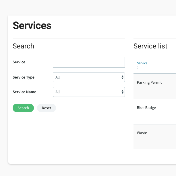
It’s fine, but for my eyes it isn’t massively different form the listing widget on the right. And creating clarity for the user is always a good thing 
So… in page builder I clicked on the search panel to change its settings. Right at the bottom of the settings there is this sneaky little option. I expanded it and added these three classes “rounded bg-light p-3” [these are classes built into MATS - more on this another day]
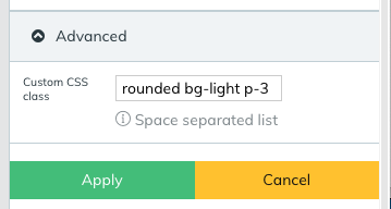
- ‘rounded’ makes the corners of the panel rounded
- ‘bg-light’ gives the panel a light grey background
- ‘p-3’ gives the panel 16px padding all round
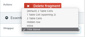
I also like the search fields to be ‘title above’ rather than in two columns:
The only other thing I need to do is add a little secret class into the theme CSS to remove the line and spacing from that heading so it lines up better:
.system_widget_search.rounded.bg-light.p-3 h3 {
    border: none;
    padding: 0;
}
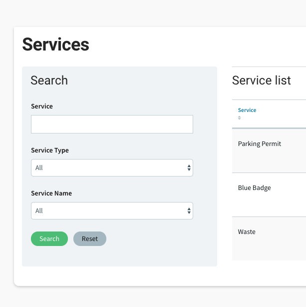
And that was it… here’s the result - hope you like it.
Feel free to ask any questions below. Always here to help
Paul Edmonds
UX/UI, Matssoft
