Hi
I’ve just been playing with something to add a little user feedback on navigation. It’s kinda cool so I thought I’d share it.
You will need to add some classes into your theme CSS:
@media (min-width: 992px) {
  .PAGETABS, .SUBTABS {
    ul.nav:hover a.nav-link:not(:hover) {
        opacity: 0.5;
    }
    a.nav-link {
        transition: opacity 0.2s;
    }
  }
}
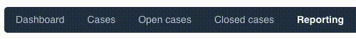
What it does:
When you rollover/hover over your page/sub tabs, the unhighlighted tabs dim in opacity.
What is the code doing?
First off, I have chosen to wrap the CSS in the @media declaration which, in this case, is set to only affect screens which are more than 992px wide.
Then we have a little SCSS. I’m wrapping two classes inside “.PAGETABS, .SUBTABS” which process all the contained classes to be available to both the pagetabs and subtabs. It’s a bit of shorthand that saves us writing the same code out several times.
Next the good stuff.
ul.nav:hover a.nav-link:not(:hover) {opacity: 0.5;} says:
If the mouse is hovering over the navigation (ul.nav:hover) then, set the opacity of the links (a.nav-link) that are not being hovered over (:not(:hover)) to 50% opacity (opacity: 0.5;).
I confess that it is a little mindblowing. The second class is much easier to understand 
a.nav-link {transition: opacity 0.2s;} merely says:
Set the transition speed of the opacity change to 0.2s
What next?
Well, this opens up all sorts of ideas… you could set all the links to have coloured bars below them which disappear if they are not being highlighted.
@media (min-width: 992px) {
  .PAGETABS, .SUBTABS {
    ul.nav:hover a.nav-link:not(:hover) {
        opacity: 0.5;
        border-bottom: transparent;
    }
    a.nav-link {
        transition: opacity 0.2s;
        border-bottom: 2px solid blue;
    }
  }
}
Paul Edmonds
UI/UX, Matssoft