Hopefully, a quick and simple question.
Our UX designer wants checkboxes to be displayed with the label on the right (the way they are in the builder configuration panel).
However, I’ve tried every combination of wrappers and presenters and scoured the config, and I can either get it to show the label on the right, above, or not at all.
Is there an easy way to designate where you want the text to appear for a checkbox?
May thanks
Stephen
Hi @camsd047 ,
It’s not possible with the default wrappers/presenters offered within the Core platform. However, you are able to this by creating your own Code Studio wrapper/presenter to achieve this.
Hope this helps 
We are about to build this so if you can wait 2/3 weeks we can probably share it with you (providing there are no big curve-balls this sprint)
Thanks Kevin, that would be great.
I’m having a crack at this myself as a learning exercise. I’m new to Create and my coding is a little rusty (to say the least).
I’ve created a wrapper which displays the checkbox as we want…
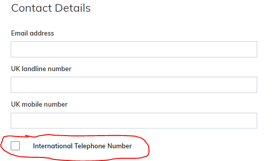
…it looks like it’s working, as I can attached visibility dependencies to the checkbox to mark fields read-only, and dislay additional fields…
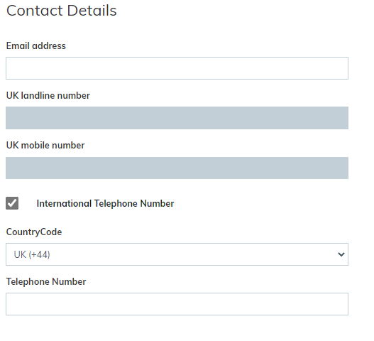
…However, when the form is submitted, the Checkbox status isn’t saved (viewing this “International Telephone Number” field in a list always displays “No”, regardless of whether the box was checked.
Is there somthing else I need to do to ensure the value of a checkbox is saved when the form is submitted?
TIA
Stephen
I’m no expert, but from what I hear from people, the field in the htm needs to be bound to the back end. Please feel free to share the code you have and we may be able to use it as a base for ours too
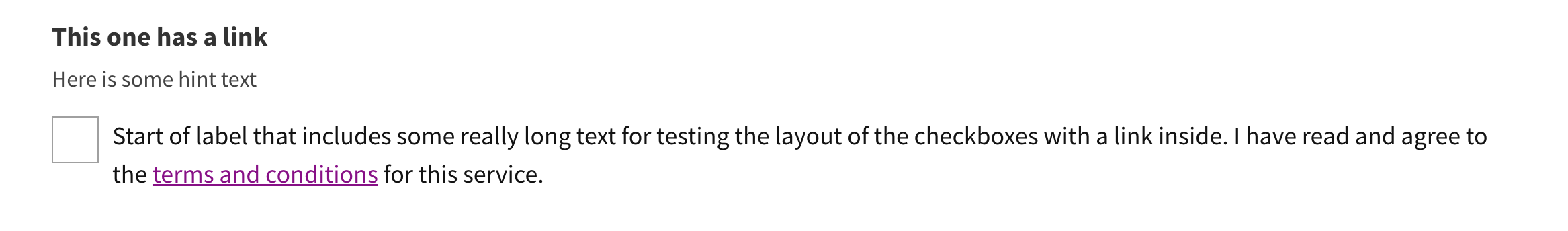
we (@james.bovington and @designdave) have now built this presenter, with the added bonus that you can put a URL in the label to go off to a terms and conditions page (this is optional).
I’m not sure how to get it to you though, as i can’t upload a zip here.
Also you’ll need the following style sheet to make it look right
/*CHECK BOX PRESENTER*/
.tick-box-cds-cont {
    display: flex;
    flex-direction: column;
    /* Hidden input */
    .tick-box-cds-hidden-input {
        height: 0px;
        padding: 0px;
        border: 0px #ffffff !important;
        outline: none !important;
        /* Prevent the input element from being highlighted */
        -webkit-user-select: none; /* Chrome/Safari */
        -moz-user-select: none; /* Firefox */
        -ms-user-select: none; /* IE10+ */
        -o-user-select: none;
        user-select: none;
    }
    /*Margin under custom radio and checkbox labels*/
    label {
        margin-bottom: 1rem;
        position: relative;
        display: inline-flex;
        align-items: center;
    }
    /*The faux checkbox*/
    label:not(.validation_error):before {
        content: "";
        display: inline-flex;
        margin: 0 10px 0 0;
        align-self: flex-start;
        width: 35px;
        min-width: 35px;
        height: 35px;
        pointer-events: none;
        -webkit-user-select: none;
        -moz-user-select: none;
        -ms-user-select: none;
        user-select: none;
        background-color: #fff;
        border: 1px solid #a0a0a0;
        background-repeat: no-repeat;
        background-position: center center;
        background-size: 50% 50%;
    }
    /*Focus style on the faux checkbox*/
    .custom-control-input:focus ~ label:before {
        outline: #ffbb00 3px solid;
        box-shadow: none !important;
    }
    /*Faux Checkbox selected tick icon*/
    .custom-control-input:checked ~ label:after {
        position: absolute;
        top: 0;
        left: 0;
        width: 35px;
        height: 35px;
        font-variant: normal;
        text-rendering: auto;
        -webkit-font-smoothing: antialiased;
        font-family: "Font Awesome 5 Free";
        font-weight: 900;
        font-size: 1.2rem;
        margin-top: 2px;
        text-decoration: none;
        text-align: center;
        color: #380;
        content: "\f00c";
    }
    /*Remove transitions checkbox*/
    .custom-control-input ~ label:before {
        transition: none !important;
    }
}```
3 Likes
Hey @kevin.rowe, great job to you and @designdave! Would you be willing to share the presenter with me as well (meike.schulz@netcall.com)?
And maybe you would like to upload if to the AppShare, if you haven’t already? I know that this can be useful to a lot of people!
Thank you very much!
Meike
Hi, just jumping on this thread as we too have a need to have the checkbox presented with the label on the right. It seems this is the expectation of most of our customer users. I couldn’t see this in the appshare. Is it possible that this could be shared with us in some way?