I am creating a pie chart and want to be able to control which slice has which colour rather than accepting the system defaults. Is there any way to do this?
Hi Angela,
I came across the same issue while creating Quick Charts and Charts (Interface > Charts).
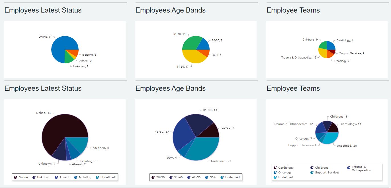
In the following screenshot first is a row of Quick Charts and second row shows Charts that I created in the end. Charts give you a selection of ‘Colour palettes’ but I am not sure if you can individually colour the slices in Charts though.
1 Like
Hi Netcall Support team,
I suspect that the answer is that I need some custom CSS. However, I don’t know CSS well enough to be able to write it. Do you have anyone who can help?
Angela
It seems a chart is an SVG image and applying a CSS might not be the easiest and shortest solution.
I see a similar enquiry under ‘Platform Suggestions & Feedback’ for more control over graphs and their colours from your side. A member of the support team will reply asap: More control over colours used in graphs
Here is why I think the CSS route might not be the quickest one: any CSS applied to a chart is applied at a much higher level DIV. As a result it is a little tricky to determine the exact segments of classes which require customisation i.e. from custom classes to individual classes.
Don’t suppose there’s any change to the pie slices situation? Is there at least some way to consistently assign a label to one of the predefined colours in the scheme?
I have a situation where (at least in the build env) a chart is assigning a blue colour to ‘Bonfires’ and an orange colour to ‘Flooding’… it’s maddening!
If you are using normal Charts (not quick charts) then you can define your own colour matching for known predicable values.
Create a new Data Type of type Colour, and within that define each colour you want and the text label it will match to. E.g. Flooding as a blue, and Bonfires as an orange.
Then in your Pie chart, one of the settings on the Basics tab is called “Colour lookup”, where you can select the Data Type you just created.
Them wherever the value of the field you have grouped your chart by matches one of the colours in the Data Type, that colour will be used instead of the default ones.
1 Like
Thanks so much Bob that sorted it perfectly! ![]()